
Within a local housing market, do the cheapest and the most expensive houses rise and fall together over the cycle? One would have expected this to be a well-documented fact, but it turns out to be surprisingly difficult to answer with the data we usually have.
House price indices typically present one number per region or local market. I can find out how much house prices grew in Chelsea last year, but not whether the bottom of the Chelsea market grew more or less than the top. As a result, most of what we know about heterogeneity in house price dynamics is about differences across places (London against the North, cities against towns), and much less about differences within them. Why is that not enough? Differences across regions can be the result of many things, such as capacity for building new housing, regulations, local economic activity, etc. It is difficult, therefore, to pinpoint the heterogeneity to a particular factor when comparing different regions.
A naïve approach (and I do not mean this in a derogatory way; that’s exactly what I did some years ago in a project) would be to simply compute percentiles of the house price distribution within each area and study how this distribution evolves. What’s wrong with this? The problem is that the houses that go to the market change with the cycle. For instance, imagine that cheaper houses tend to go on the market more often during booms. If I am simply tracking the distribution across time, it might look like it moves to the right during a bust. The key distinction is that we are interested in the price of housing. We need to isolate changes in the price of housing from changes in the composition of houses that go on the market.
The standard ways of dealing with this are to follow the same house across sales (repeat-sales indices) or to adjust prices for the characteristics of the property (hedonic indices). Neither is easy to apply here. The same house rarely sells twice within a short window, so repeat-sales samples become thin in a local market, let alone, as we want to do here, in one segment of it; and hedonic indices require characteristics that transaction data generally do not contain.
In a recent paper, I try a different route, which relies on a peculiarity of the UK: its full postcodes are very granular. There are almost two million of them for fewer than thirty million households, so an average postcode covers around fifteen homes. I define a unit as a postcode-house type pair (say, terraced houses in a given postcode) and, each quarter, I keep the units that also transacted a year earlier. That seems close enough to “the same house” for this purpose. Within a local authority, I then compute the percentiles of prices over exactly that set of units in both quarters and take the growth rate. Since the basket is the same at both ends, the change should reflect the price of housing at that point of the distribution rather than a change in which houses happened to sell. I call the result distributional house price indices (DHPIs), and I build them for the 20th, 40th, 60th and 80th percentiles of every local authority in England and Wales from 1996 to 2019 (the paper also uses finer sets of percentiles; the results are very similar). Figure 1 shows the average across local markets of the four indices.
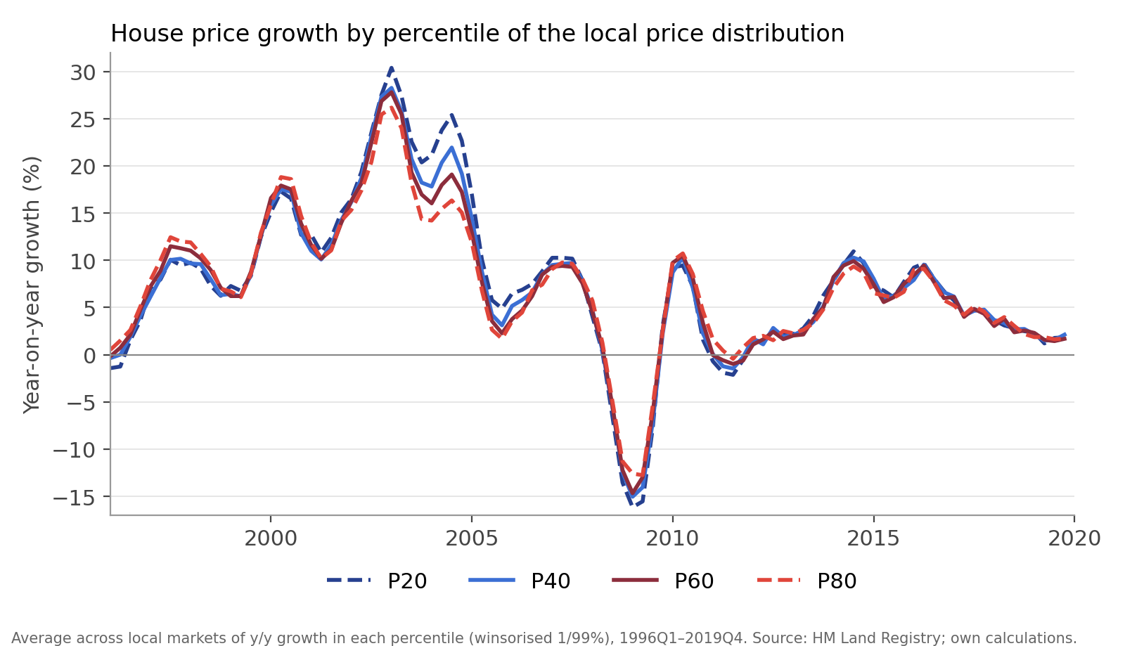
The four lines move together, which is reassuring: the indices seem to pick up the cycle we all know. But they do not move by the same amount. At the top of the boom, in early 2003, the 20th percentile was growing at around 30% a year against 26% for the 80th. At the bottom of the bust, in early 2009, it was falling at 16% against 13%. In calmer years, the lines almost coincide. Figure 2 plots the difference between the growth of the 20th and the 80th percentiles, which makes the pattern easier to see.
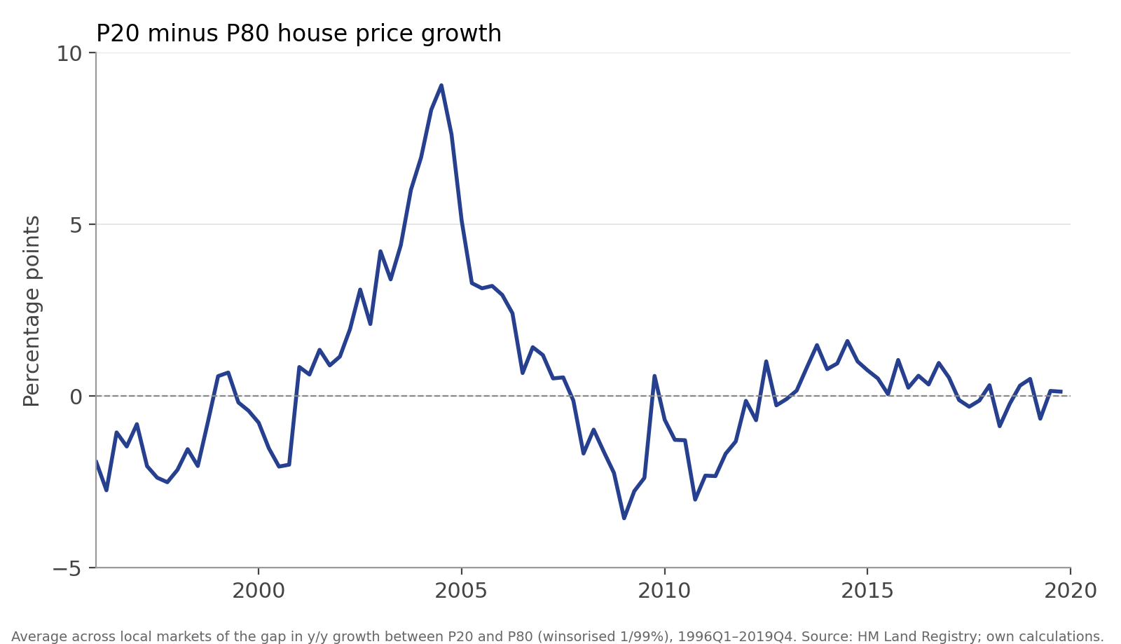
The spread is clearly pro-cyclical. Through the 2002–2005 boom, it averaged close to five percentage points a year, peaking at nine points in 2004. In the 2008–2010 bust, it turned negative, reaching almost minus four points in early 2009. Over the whole sample, however, it averages less than half a point and is positive in only slightly more than half of the quarters. Therefore, this does not look like a story about cheaper houses being a better (or worse) investment; it looks like a story about cheaper houses having a more volatile cycle.
All of this is within a local market. Still, one could worry that the averages are driven by a handful of places, or by the familiar divergence between London and everywhere else. Figure 3 maps the two halves of the global financial crisis separately: for each local authority, how much the bottom of the distribution outgrew the top during the 2002–2006 expansion, and during the 2007–2011 contraction.
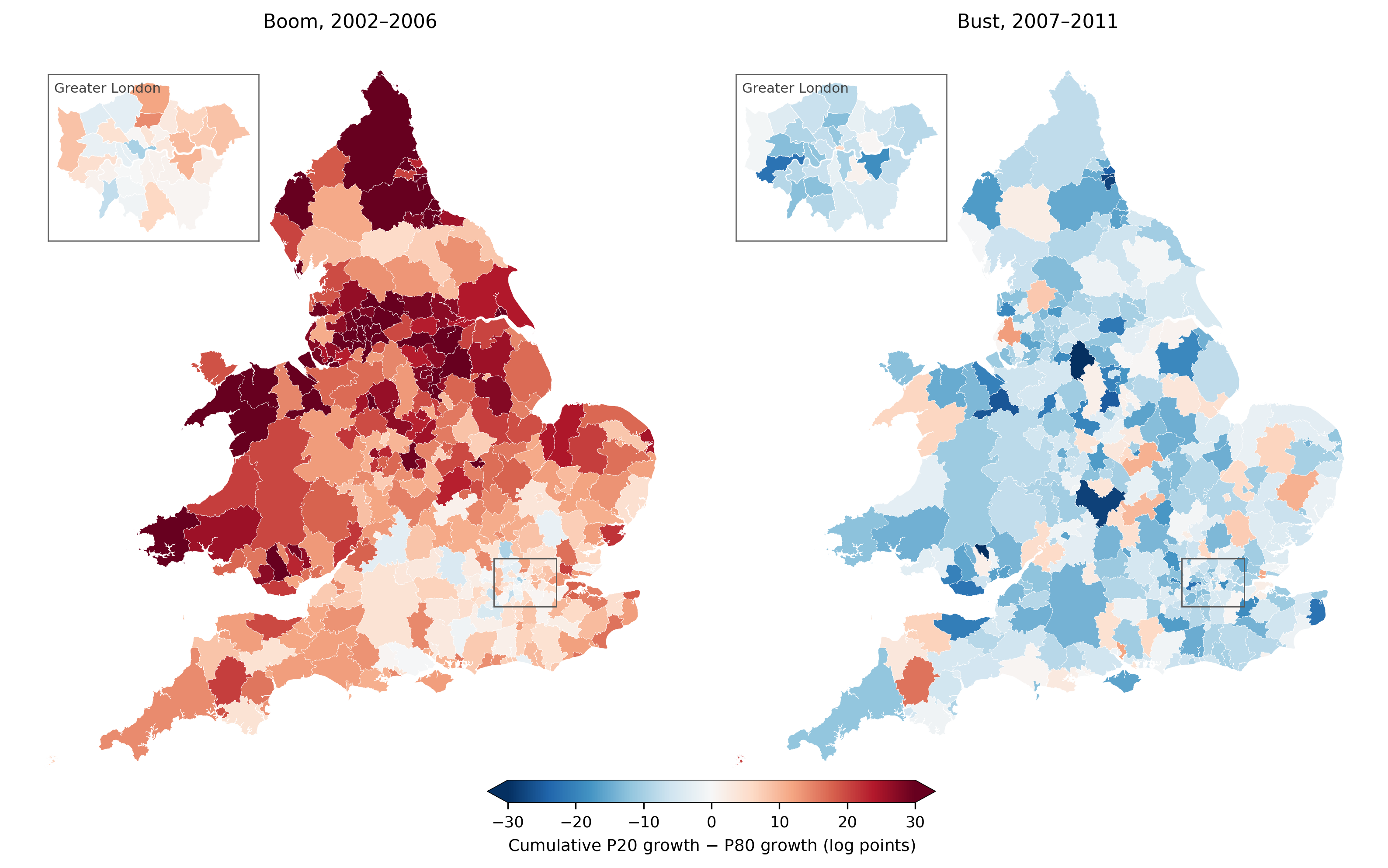
In the expansion, cheaper houses outgrew more expensive ones in 93% of local markets. In the contraction, they fell behind in 85% of them. More than three quarters of local authorities are red on the left map and blue on the right. The cyclical differences within markets, then, do not appear to be simply a regional phenomenon: something similar happened in most markets of the country.
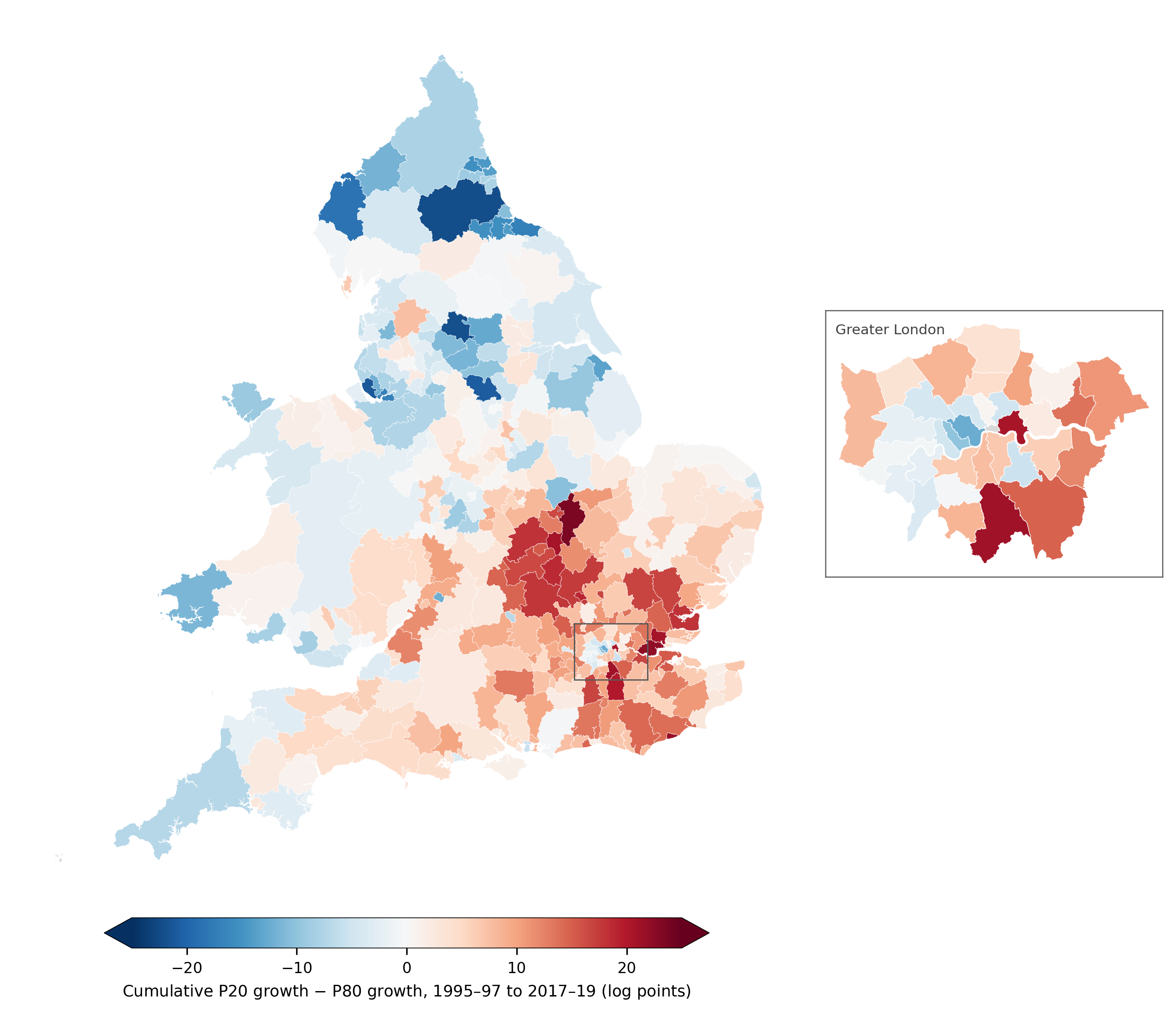
What about the long run? Between the mid-1990s and the late 2010s, prices roughly quadrupled in the typical local market, while the cumulative gap between the 20th and the 80th percentiles amounts to only a couple of log points on average. The boom and the bust seem to have largely cancelled out. That average, however, hides a fairly clear geography, as Figure 4 shows. The bottom of the distribution gained the most along the Thames corridor and the outer commuter belt and in outer and east London. It lost the most in the northern cities, and in general, the North of England saw the top outperforming the bottom of the distribution.
The paper focuses on the cyclicality of the gap (Figure 2) rather than the long-run differences. In the next post, I will go over the determinants of this cyclicality. But seeing the shape of the gap, a good candidate easily comes to mind: credit.


Pingback: Distributional house price cycles (2/2): What explains the divergence? | Francesc's Blog